
You don’t need to be an expert in UX design to know when it’s bad. Whether it's clunky scrolling patterns or baffling button placement, most people can tell when a design isn't working.
But bad UX can negatively impact a brand. US design determines our feelings about the products with which we interact. On the other hand, brilliant UX design that empathizes with the customer and is intuitive and elegant makes a product enjoyable to use, and that can positively impact the bottom line.
If you’re a UX designer, it’s important to become familiar with UX design best practices so you avoid rookie mistakes and elevate the customer’s perception of your brand. Here’s the rundown of important UX design principles every designer should know.
The importance of UX design principles
Why not follow your gut and design any way you’d like? Primarily because good design has nothing to do with you and everything to do with your audience. Your role as a UX designer is to eliminate friction from the user experience, and that friction is a perpetually moving target.
But the good news is that the research of how to eliminate friction has been largely determined already, so you don’t need to reinvent the wheel. When you integrate solid UX design best practices into your site or product or app, you can expect to see the following benefits:
- Greater traffic: A site with great UX sets itself apart from the competition and ranks higher in search results.
- Higher checkout and more completed journeys: You want your users to gain knowledge, make choices, and complete actions. If your site causes friction, you’ll see higher abandonment rates.
- Higher customer satisfaction: When your site or product empathizes with the user, they’ll be more likely to return again and again.
When all these benefits come together, you can anticipate satisfying the user’s needs and becoming an integral part of their life.
UX design best practices
Use the following best practices to take your UX design to the next level.
1. Put yourself in the users’ shoes
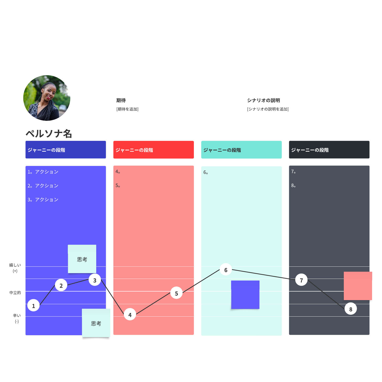
This principle may seem basic, but it’s too important not to mention: To create a website or app with the ideal user experience, you have to understand your users deeply and keep them top of mind throughout the process. What do they need from your product or service? How are they feeling at each touchpoint?
A customer journey map is an ideal tool to help you imagine the experience your potential customers may have and present your user research in an accessible way.
2. Make it accessible
Good design should work for everyone. That includes those who experience sight and hearing disabilities. Consider, for instance, the 8% of men who are colorblind. Though that may seem like a small percentage of the population, it actually equals over 26 million American men.
By conforming to accessibility standards in your UX practices, you’ll increase the number of people who can interact with your product or site. Ultimately, it’s about empathizing with your audience. When you design your site, check its level of accessibility with evaluation tools available online. You’ll be given a list of improvements you can make to improve your accessibility.
3. Keep it consistent
Consistency is a core tenet of UI/UX best practices. Design consistency limits confusion, builds trust, and reinforces your brand. When your UX design is consistent, users will learn how to navigate your UI faster and will be able to execute their tasks with less distraction and confusion.
When applying this UX practice to your design, focus on these key elements:
- Visual consistency—This includes the fonts, buttons, colors, images, and other visual elements you use across your product or site design.
- Functional consistency—Similar controls and functions work the same way to maintain predictability and intuitive navigation from page to page, and even between products under one brand.
- Voice and tone—Stick to a consistent voice and tone in the way you speak to your users through your product. This includes everything from homepage copy to your error messages.
Familiar patterns—Don’t reinvent the wheel with every UX design. Users will be familiar with certain UX patterns across the digital space, so look to include these patterns in your design to make the experience seamless.
4. Make a sitemap
No one wants to get lost in life or on your site. A map will help. A sitemap is a vital tool of good UX design. They visualize your site's organizational hierarchy and map out how each page relates to each other. Creating a sitemap also helps both you and your user navigate the site to find the right information and products.
Plus, when you want to add to your site, you can clearly understand where a new page should live. Further, when you delete a page, it still lives forever as a 404, so you’ll need to keep track of your redirects. Maintaining an updated and well-organized sitemap can ensure these details don’t fall through the cracks.
Lucidspark offers a free website flowchart template. It’s a great place to start.
5. Use clear navigation tools
Clear, consistent navigation from page to page can make a huge difference in how people experience your site. There should be a sticky header, which is a navigation bar that stays in the same place from page to page, at the top of the screen.
Your users have pre-established behaviors and expectations from over a decade of using internet products. So, among other things, they expect to find a search bar at the top of your page, organized drop-down menus that lead to landing pages, and a log-in button. Similarly, at the bottom of your page, your users expect to find company information, contact info, and links to the career pages.
6. Keep copy clear
Your users don’t want to have to guess what you mean. If you label a button “Shop now,” your user will expect to be taken to a product page where they’ll have the ability to buy. On the other hand, if a button says, “Join now,” your user likely has questions: What are they joining? Why should they join? Is there a buffet? When writing for users, your copy should be concise, clear, and accessible.
When we say “accessible,” here, we mean that your writing should be at about an 8th-grade reading level and should not require any specialized knowledge. An error message, for instance, should not go into the details of why a page isn’t loading. It should simply say “Page cannot load.”
7. Test and test again
Usability testing is easier than ever. Before you launch your site, test in a staging environment so you’re not altering a live site. Then, use data to constantly improve your site’s design. Consider A/B testing and heat mapping as well as recording live feedback from users as they interact with your site or product. Then, adjust according to the results and test again.
Your design is a living piece of art that will continually evolve and improve, so don’t allow it to remain stagnant for too long.
8. Design to context
Look at your site analytics to determine how your users are engaging with your product. If most of your users are on a mobile device, you’ll need to prioritize design for ease on the go. If most of your users are iPhone users, you’ll want to incorporate Apple Pay.
9. Keep it simple
Humans love white space. It helps brains better process information and decreases cognitive load. While it may be tempting to create complex designs with fancy animations, it’s ultimately best to keep design simple, easy to understand, and fast. Avoid colored backgrounds or cluttered text boxes. Keep text minimal and images clear.
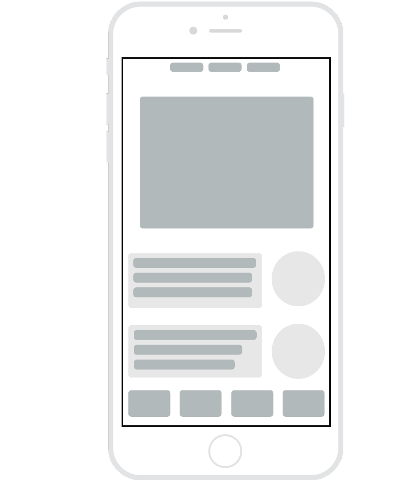
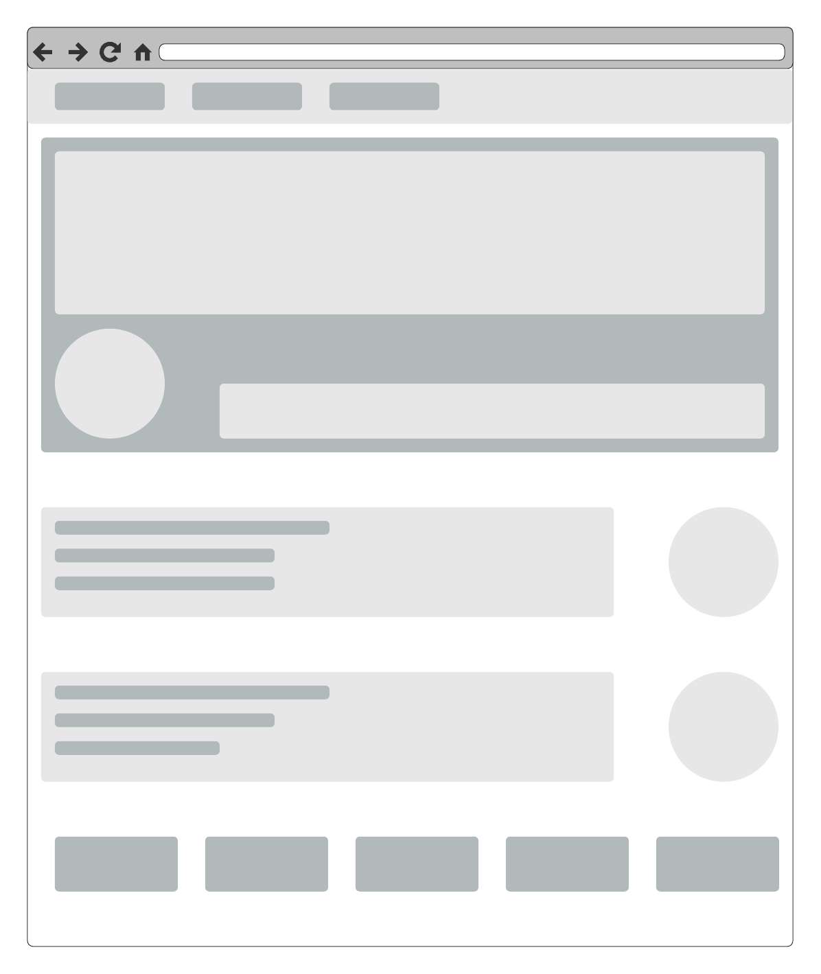
In the early stages of design, consider creating low-fidelity mockups to boil your webpages or applications down to the most important design elements.
Consider these templates to get started.
10. Understand the role of typography
The hierarchy of text on a page plays an important role in your user’s understanding. Use H1s sparingly and only for the most critical messages. Use H2s to divide the text into sections, then H3s for subsections. Your users are going to scan text instead of reading it carefully, so dividing your text will help them comprehend messages and jump to the sections most relevant to them.
When you put the user at the forefront of your design, you’ll create a product that people want to use. That means a healthier bottom line, a more loyal user base, and a happier executive team. Further, best UX practices provide great guidance. If you find your user satisfaction declining, you can go back to these best practices and make sure you’re getting the basics right before you delve into more advanced techniques.

Learn how customer journey maps result in better UX design and start creating one now.
Read moreAbout Lucidspark
Lucidspark, a cloud-based virtual whiteboard, is a core component of Lucid Software's Visual Collaboration Suite. This cutting-edge digital canvas brings teams together to brainstorm, collaborate, and consolidate collective thinking into actionable next steps—all in real time. Lucid is proud to serve top businesses around the world, including customers such as Google, GE, and NBC Universal, and 99% of the Fortune 500. Lucid partners with industry leaders, including Google, Atlassian, and Microsoft. Since its founding, Lucid has received numerous awards for its products, business, and workplace culture. For more information, visit lucidspark.com.
Related articles
6 best UX design tools
UX design tools help teams streamline the design process and deliver high-quality experiences. See our picks for essential UX design tools.
Bridging the gap between designers and developers
Here's how to bridge the gap between design teams and development teams to create a truly stellar customer experience.
All about the Double Diamond UX design process
Double Diamond UX design is a customizable, structured framework that promotes divergent and convergent thinking.
Bring your bright ideas to life.
or continue with


By registering, you agree to our Terms of Service and you acknowledge that you have read and understand our Privacy Policy.