
Think back to the last time you visited the dentist. If you had a cavity, there’s a good chance the dentist showed you the x-ray of your teeth, pointed to the white circle marking your tooth’s decay, and then gently suggested you floss more often. There’s a reason the dentist showed you the x-ray: it’s much faster and easier for you to understand a picture than to grasp dental jargon.
Why does this matter? Because not using visuals in strategic analysis is much more painful than a mouth full of cavities.
Visuals are absolutely crucial in strategic analysis. In this blog, we’ll explain the basics of strategic analysis, why visuals are imperative, and which visuals are best to incorporate into your own strategic analysis.
The basics of strategic analysis
Strategic analysis sounds about as fun as, well, visiting the dentist. But that’s only if you take its very uninteresting name at face value: behind the sterile name is a world of insights, possibilities, risk mitigation, and potential.
Strategic analysis is an approach that helps organizations explore opportunities for growth, tackle challenges within your industry, and make better business decisions. Strategic analysis aims to help organizations plan for the future by looking at the organization’s processes, technology, and current capabilities. It’s a holistic look at the whole business from the inside out, and it’s an approach that can help make the organization healthier overall.
Strategic analysis is the “reals before feels.” In other words, it helps businesses look at the facts instead of relying on assumptions about everything from technology to market position. Strategic analysis is a valuable tool that can help businesses get to where they want to be based on where they currently are. It’s a reality check that can help ground everyone in the business.
Why visuals are helpful for strategic analysis
If your dentist began talking to you about quadrants and occlusion, you’d have no idea what they were talking about. That’s where the x-ray comes in. Visuals are helpful for providing clarity. When your audience can see a visual representation of your work, it’s much easier for them to understand what you’re saying.
Here are some of the benefits of incorporating visuals into your strategic analysis:
Make numbers interesting—Numbers on their own aren’t interesting; it’s what they represent that can be fascinating. By adding visuals about what numbers mean, your audience can first understand and then care.
For instance, if you’re giving an Operating Income Before Depreciation and Amortization (OIBDA) presentation, your audience will likely zone out before you get to the most thrilling parts of financial analysis. Instead, show them graphs that put the numbers in context or projections of what could happen. When you tell stakeholders that 70% of the operating budget is going to pizza parties, that has less of an impact than showing a pie chart that demonstrates how big a chunk is going to...well, pizza pie. Visuals help people invest in what you’re saying and understand what the numbers actually mean.
Put it in context—It’s one thing to talk about a hurricane and quite another thing to show the damage caused by a hurricane. When you use visuals with your strategic analysis, your audience can better understand why the analysis matters to your company. Line graphs are especially effective for this which is why stockholders rely on them to understand their market position.
They make you look good—Quality matters. If you’re in charge of strategic analysis, it’s not just about how good your analysis is, but how well you present that analysis to others. Your work will be seen more favorably if it’s presented in an accessible way that appeals to your audience and makes your work easily understood.
Common diagrams for strategic analysis
There’s another way usually visuals can help you perform strategic analysis: there are common diagrams that act as guideposts showing you the best ways to present your findings. By using these common diagrams, you don’t need to come up with a great new way to display your data: you simply need to plug in the information into diagrams that have already been proven useful.
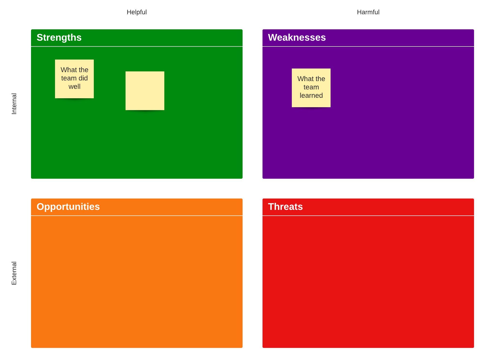
1. SWOT analysis—SWOT stands for strengths, weaknesses, opportunities, and threats. This diagram distills findings into the most important high-level summaries for each of those four areas. At a glance, the audience can immediately know important areas to focus on.
Great for: Developing a long-term business strategy based on what your company does or doesn’t do well.
2. PEST analysis—PEST stands for political, economic, social, and technological. This diagram displays your business through the lens of four important impacts of business. A PEST diagram helps organizations understand outside forces that can grow or hinder the business, and it’s helpful for showing the potential of the business from the outside in.
Great for: Examining the potential of your business or understanding what could lead to a business’s growth or decline.
3. Porter’s Five Forces—This diagram looks at five forces of power within your business and where your company’s competitive position currently lies. By examining the supplier power, competitive rivalry, threats of substitution, buyer power, and the threats of new entry, you can determine where your business sits in the market.
Great for: Understanding what happens if your business brings a new product to market, implements a new strategy, or branches into a different arena.
4. BCG Matrix—A BCG matrix is a growth share matrix, and it examines the life cycle of products. This is useful for businesses that want to understand how well their products are performing: high growth, high share products are the most valuable and low share, low growth products are poor performers.
Great for: Knowing which products to focus on and which to discontinue.
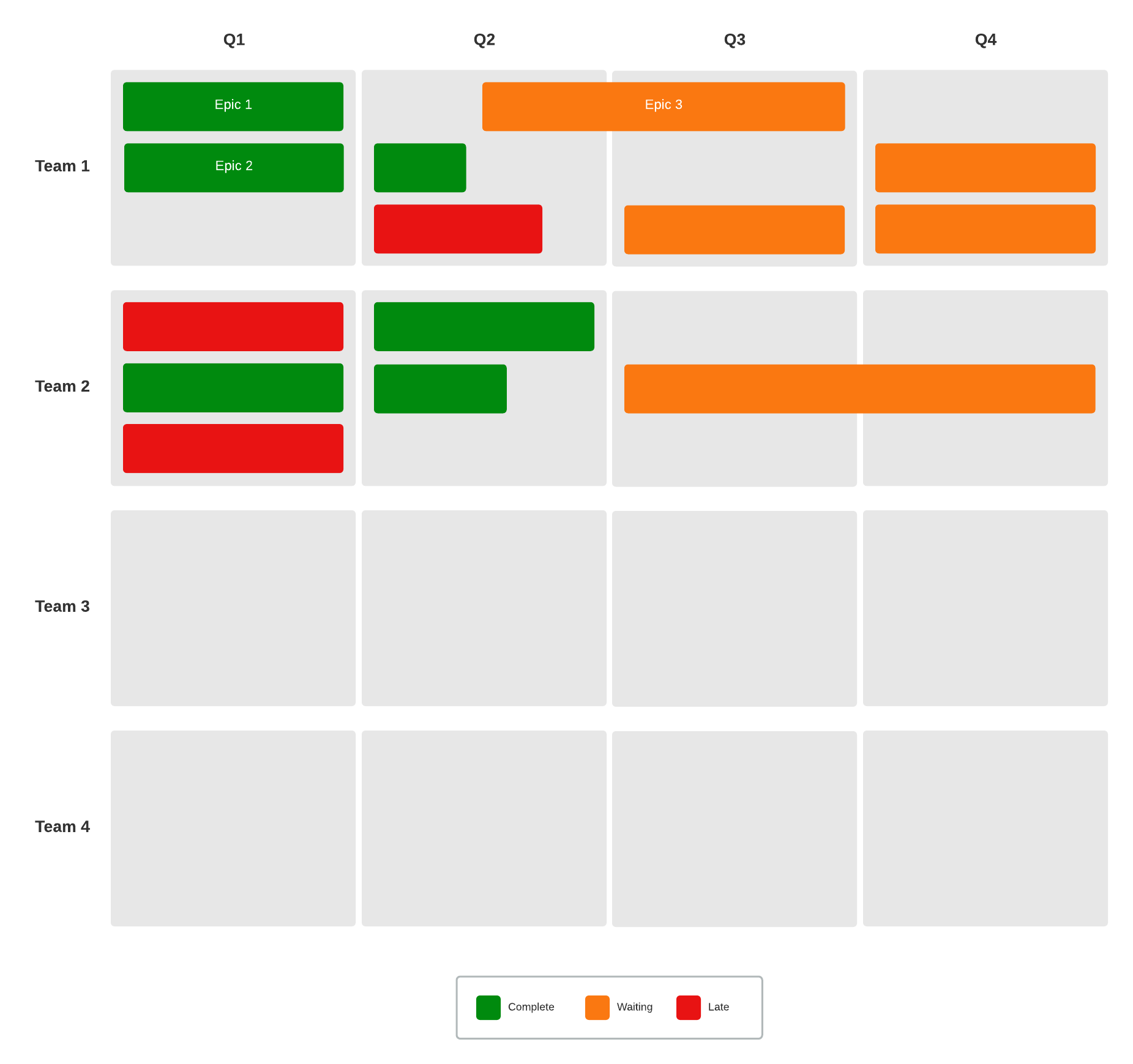
5. Roadmaps—Roadmaps aren’t just for cars: they can be invaluable for businesses, too. Roadmaps show exactly how your business needs to get to where it wants to go, and it’s laid out in a clear, concise way that anyone can understand.
Roadmaps are great at uniting disparate groups across the organization; after all, it’s easier to get everyone to agree on a strategy that’s pointed at a final destination everyone wants to get to. The roadmap is an especially engaging visual because it’s highly motivating. When your audience can see what the end result could be, they’re willing to work harder to get there.
Great for: Sharing a long-term vision, setting priorities, and setting a clear goal
Revisit your analysis over time
Your strategic analysis isn’t set in stone. As time passes, it should be revisited and reviewed to make sure it can continue to work for your organization. Consider, for instance, how important remote working has become. When the world experiences large shifts, your strategic analysis will likely have to shift, as well. You may find that previous findings need to be scrapped altogether, and that’s totally fine.
Being flexible and bending with the market will keep your business healthy. If you’re afraid of questioning previous findings, you may find that the business is less resilient. Strategic analysis is a fluid process, so be comfortable with the “this is true now, but may not be true five years from now” mindset. That’s the best way to deliver the most valuable analysis for your business.

Now that you know how visuals help improve your analysis it’s time to conduct your own strategic planning session in Lucidspark.
Get started todayAbout Lucidspark
Lucidspark, a cloud-based virtual whiteboard, is a core component of Lucid Software's Visual Collaboration Suite. This cutting-edge digital canvas brings teams together to brainstorm, collaborate, and consolidate collective thinking into actionable next steps—all in real time. Lucid is proud to serve top businesses around the world, including customers such as Google, GE, and NBC Universal, and 99% of the Fortune 500. Lucid partners with industry leaders, including Google, Atlassian, and Microsoft. Since its founding, Lucid has received numerous awards for its products, business, and workplace culture. For more information, visit lucidspark.com.
Bring your bright ideas to life.
or continue with


By registering, you agree to our Terms of Service and you acknowledge that you have read and understand our Privacy Policy.